Documentation
Appearance & theming
Match the widget to your brand: colors, presets, fonts, dark mode, launcher icon, position, and size.
Everything visual lives in the Theme tab of the widget customizer. Changes are saved to the widget and apply everywhere it's embedded — no need to re-copy the code.
What you can change
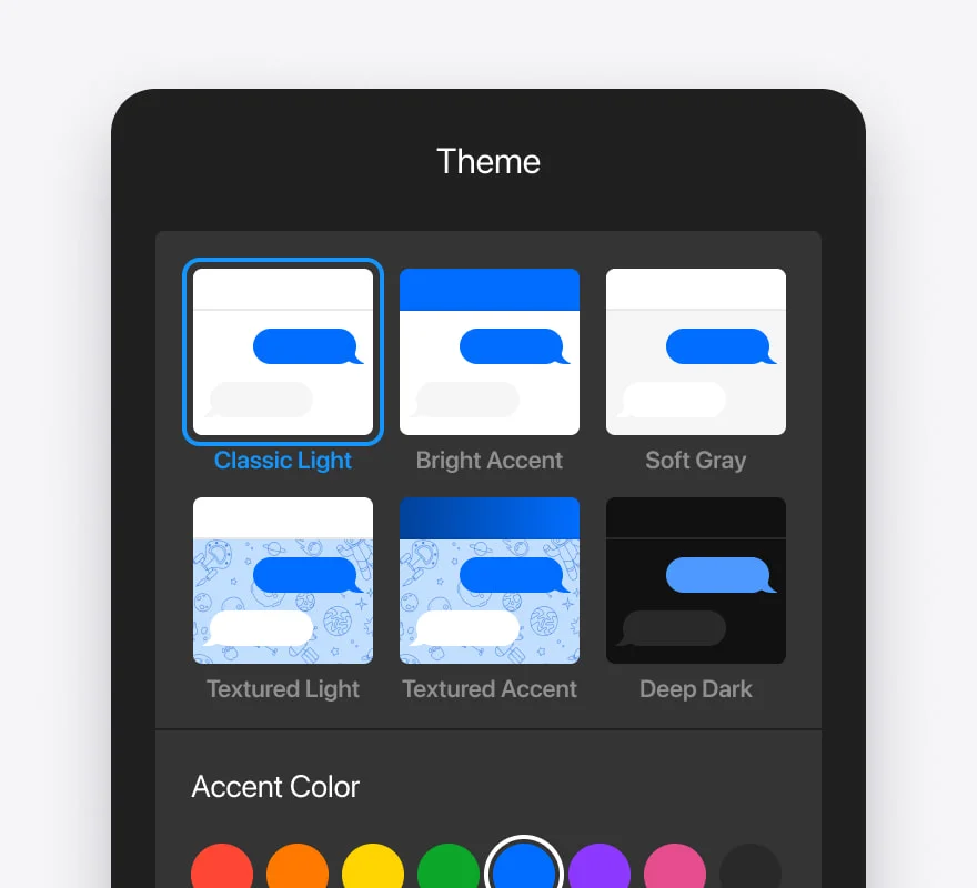
- Colors — primary/accent, header, chat background, user & bot bubbles, and input.
- Presets — one-click premium color themes to start from.
- Fonts — a set of curated typefaces.
- Dark mode — a dark variant of the widget.
- Shape & depth — border radius, shadow intensity, and bubble size.
- Launcher icon — chat, bot, help, or sparkle.
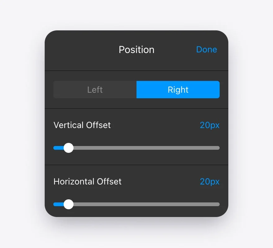
- Position — bottom-right or bottom-left, with optional offsets.